Brand Identity & Packaging:
– Creating a distinct, premium visual identity for box and tin packaging.
Website Design & UX:
– Building a digital experience that simplifies browsing, highlights the brand’s commitment to sustainabilit.
Consistency Across Touchpoints:
– Ensuring that the branding translates well across physical packaging and digital interfaces.
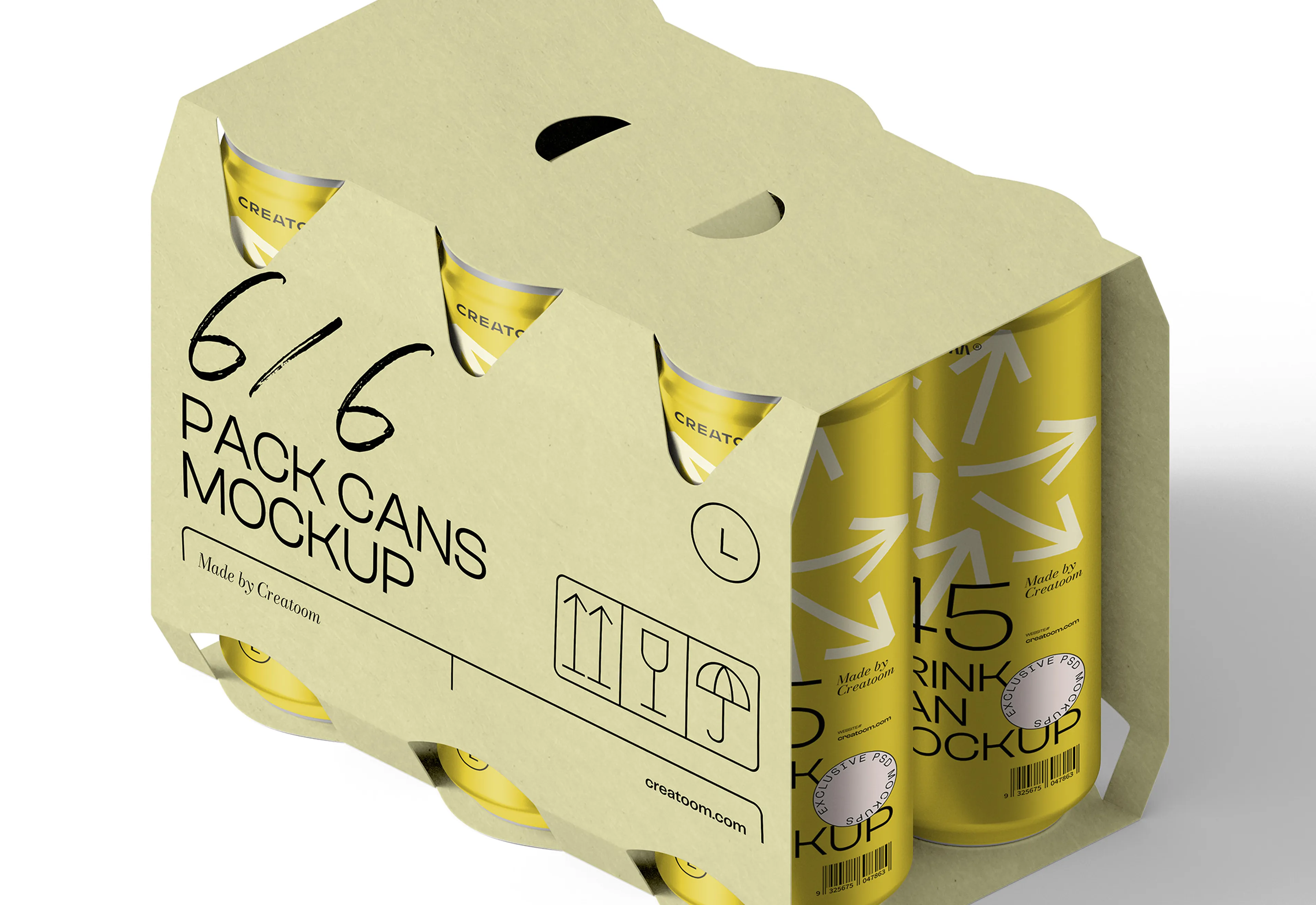
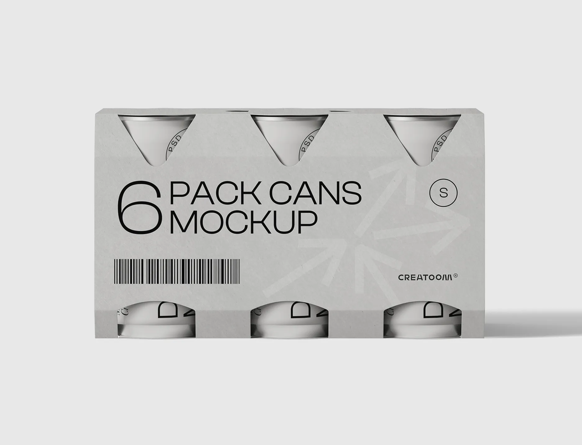
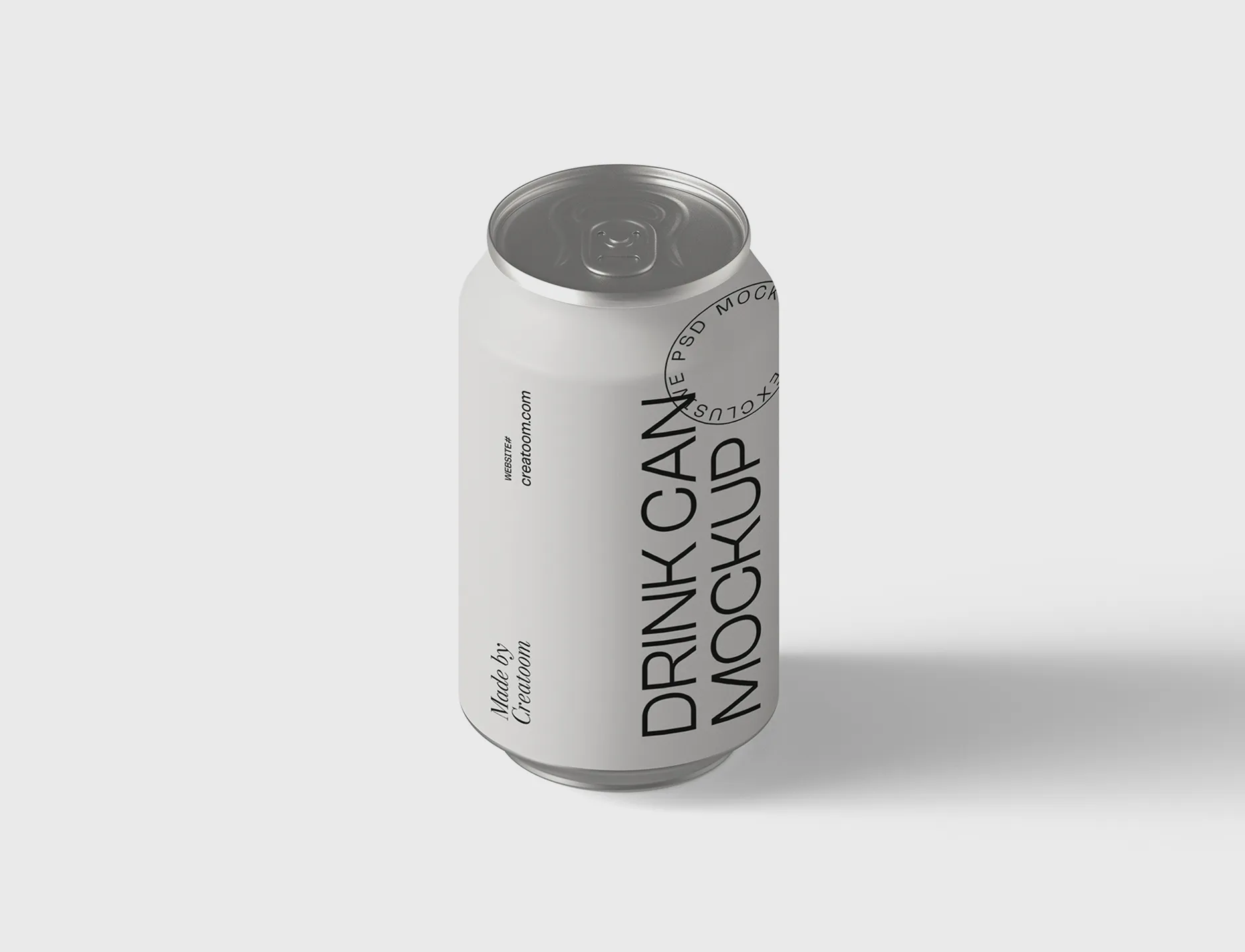
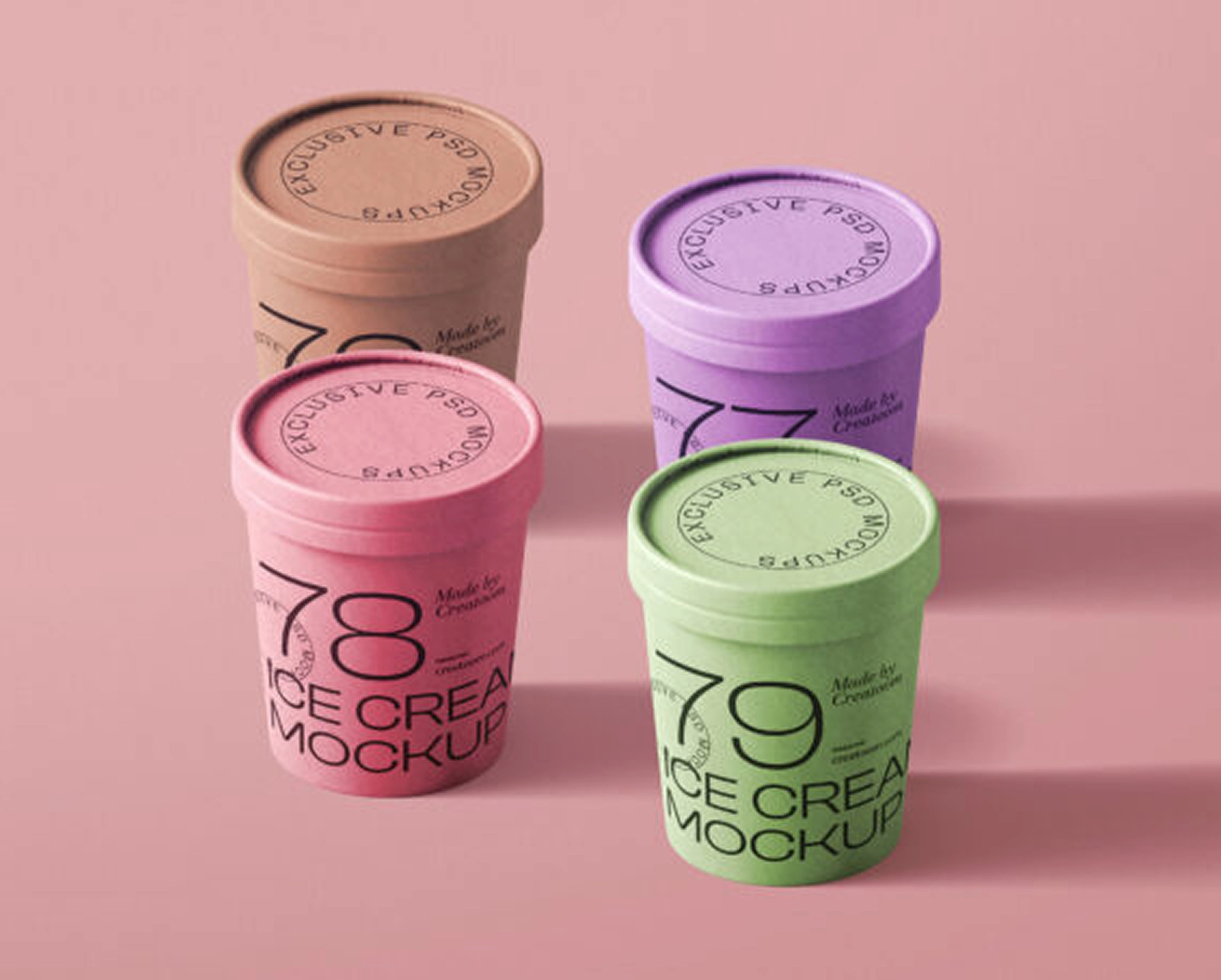
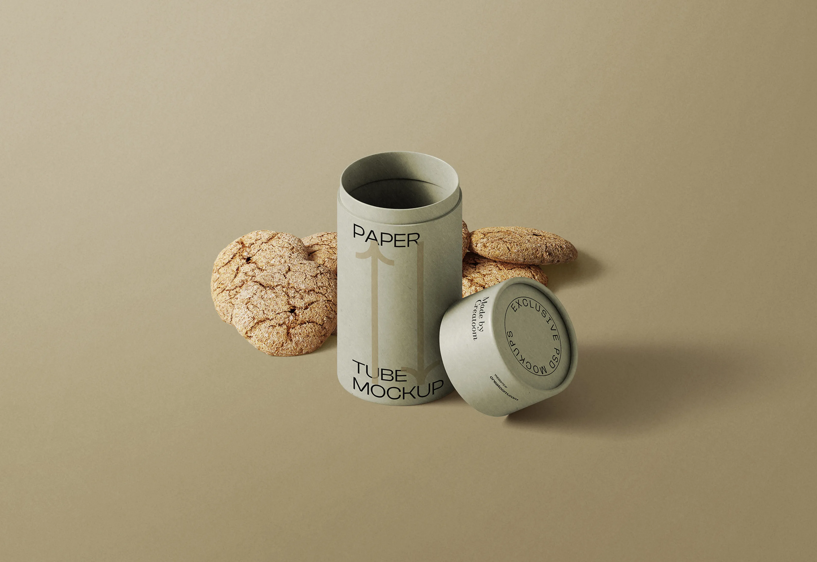
We began by developing a visual identity that encapsulated PAPER BOX’s core values—sustainability, quality, and simplicity. The logo was designed to be minimal yet bold, ensuring instant recognition across both print and digital platforms. We incorporated earthy tones, clean typography, and subtle design elements that complemented the eco-conscious nature of the brand. For the packaging, we focused on a refined aesthetic that balanced modern elegance with practicality, making the boxes and tin cans not only visually appealing but also functional and sustainable.
Translating this identity into a digital space, we designed and developed a website that provided an intuitive and immersive experience. A clean, grid-based layout was implemented, allowing the packaging to take center stage through high-quality visuals and subtle animations. Every page was structured to enhance user engagement, from interactive product showcases to an easy-to-navigate catalog. By prioritizing simplicity and clarity, we ensured that customers could explore, inquire, and engage with PAPER BOX effortlessly.
Quick answers to your questions. need more help? just ask!
A showcase of bold creativity and strategic execution.